Documentation
The complete guide to building high-performance, interactive SVG animations for the modern web.
Why Bandit Animation?
Traditional web animation is a struggle between performance and developer experience. Bandit Animation solves this by providing a visual interface to orchestrate complex SVG animations that export to clean, production-ready React code. No runtime bloat, no complex dependencies - just pure, optimized Framer Motion components.
Installation
Bandit Animation components are framework-agnostic but optimized for the React ecosystem. To get started, ensure your project is set up with the necessary dependencies.
Prerequisites
Our generated components rely on framer-motion for performant, hardware-accelerated animations.
How It Works
From static SVG to interactive React component in three simple steps. Streamline your workflow and bridge the gap between design and development.
Import & Parse
Upload your raw SVG file directly into the editor. Bandit automatically parses the DOM structure, identifying paths, groups, and shapes. No manual cleanup required - we handle the optimization for you.
- Preserves layer hierarchy
- Clean, semantic markup
Visual Orchestration
Use the timeline to sequence your animations. Define specific states like Hover, Tap, and Initial. Tweak timing, easing curves, and properties with immediate visual feedback.
- Interactive state management
- Real-time preview
Interactive Logic & Hierarchy
To create complex interactions like hover or click effects that trigger child elements, you must establish a Parent-Child relationship.
1. Hierarchy & Parenting
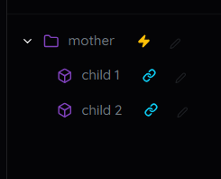
- Child needs Mother: Any interactive path must be linked to a group.
- Mother is Independent: A group doesn't need children. It can animate on its own!
2. Icons & States
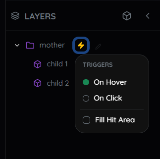
Look for these indicators in the timeline:
Link: Indicates a path is successfully connected to a Mother.
Zap: Indicates an active trigger (Hover/Tap) is applied.
3. Trigger Areas (Hit Box)

For small icons, add a transparent "Hit Box" rectangle to the parent group. This enlarges the clickable area, ensuring users can easily trigger the interaction without needing pixel-perfect precision.
Pro Tip: Animation Logic
If you place a keyframe at 0.0s without setting a specific Initial state, the engine assumes a linear animation from the element's default position. This is perfect for simple movements or continuous loops.
For complex effects, explicit is better. Define the Initial State first (e.g., set Opacity to 0). Then, animate "on top" of it. This separates where it starts from how it moves.
Export & Integrate
Once your animation is perfect, hit export. You'll get a single .tsx file containing your self-contained component. Simply drop it into your application, and it works instantly.
<MyAnimatedIcon />The Final Result
Editing icons shouldn't take days, or even hours. With Bandit, it takes only minutes.
From static SVG to a fully interactive, production-ready React component. Perfect for premium web design, engaging micro-interactions, and performance-critical animations.
API Reference
Every generated component comes with TypeScript definitions and a standard set of props for easy customization.
| Prop | Type | Description |
|---|---|---|
| size | number | string | Controls the width and height of the SVG. Defaults to the original dimensions. |
| stroke | string | Overrides the stroke color of all elements. Defaults to the original SVG colors if not provided. |
| fill | string | Overrides the fill color of all elements. Defaults to the original SVG colors if not provided. |
| className | string | Standard React className for adding custom styles or utility classes (e.g. Tailwind). |
| ...props | SVGProps | Passes through all standard SVG attributes (onClick, style, aria-label, etc.). |
Note: If you don't provide stroke or fill props, the component will use the original colors baked into the SVG.
Examples
Basic Usage
Import and use just like any other React component.
import { AnimatedLogo } from './components/AnimatedLogo';

export default function App() {
  return (
    <div className="header">
      <AnimatedLogo size={48} />
    </div>
  );
}
Custom Styling
Override colors and add Tailwind/Bootstrap classes.
<AnimatedIcon
  stroke="#a855f7"
  className="hover:scale-110 transition-transform"
  onClick={() => console.log('Clicked!')}
/>